THE EVALUATION OF MY MEDIA MUSIC MAGAZINE PRODUCTS.
1.In what ways does your Media Product use, develop,or challenge forms and conventions of real Media products?
On PowerPoint slides I have annotated features they have in common and then other features that are different in comparison to another Music Magazine media example.
FRONT COVER
CONTENTS PAGE
DOUBLE-PAGE SPREAD
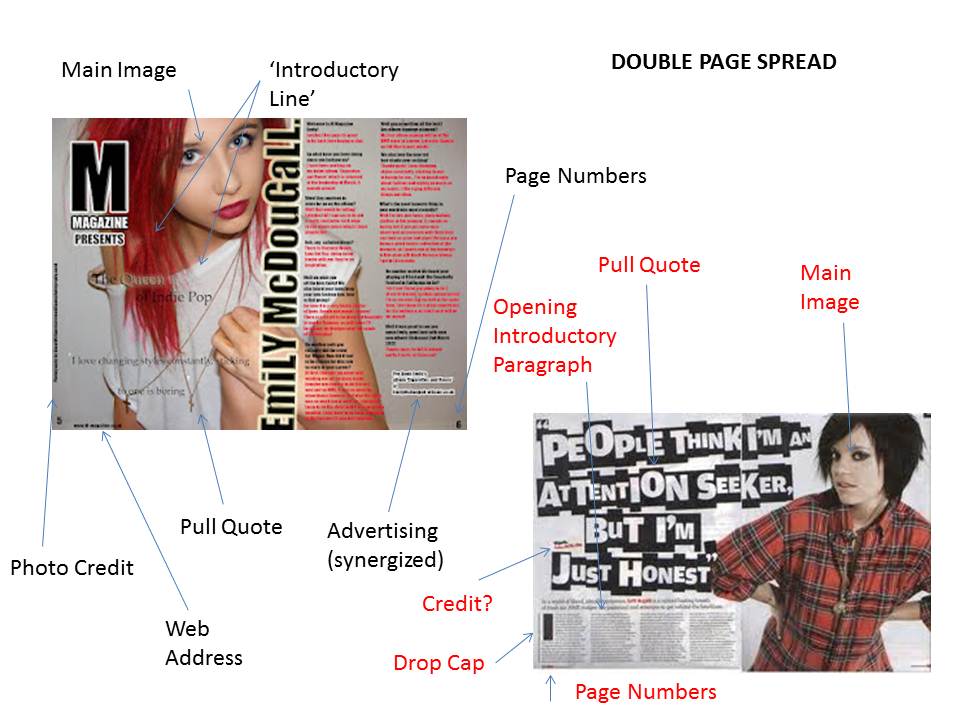
I didn't use all the conventional features on each design as I felt that they 'took over' the whole design I had specifically created for each of my Media Products. Especially in the double-page spread. I wanted the image to be bright and clear to the reader so that is why I made the pull-quote delicate and small, and the 'artist''s name rotated on the side, to make better use of space but also in a unique layout in comparison to the majority of music magazine's double-page Spread titles. I used a house style of red/pink shades, black and white as I felt they contrasted but in a clear and 'quirky' way, but I aimed for a quirky, cool edge to my magazine and I feel this is why they blended well. As my magazine is also aimed at 'indie' people, they are stereotypically known as 'quirky' and always looking for originality which is what I was trying to aim for when designing this magazine.
I used conventional features also such as web-addresses and 'freebies' and also a splash/puff to help entice the consumers of my market. I also used black and white for my masthead with some bevel/emboss and stroke effects alongside inner and outer glow to name some. I thought these contrasted well which helped make it stand out a lot. This scheme also helped the coverlines stand out.
2.How does your Media Product represent particular Social Groups?
I chose to base my Music Magazine's Genre on 'Indie' music. I have also added a 'Rock' edge to this. Indie stands for 'Independent Rock' but in music this defines the terms 'independent of Major Labels/Mainstream 'stuff'. It also defines the independence from major commercial recording such as Universal and EMI Records. It also had a 'DIY' ('Do-It-Yourself') approach to recording and publishing, for example Rough Trade, especially in its early days. It has aspired in the 60;s and 70's garage, punk and post-punk in the 80's, to a more experimental and 'werid' alternative sound depending on the band/artist these days. People who listen to indie are basically 'indies' some are also refered to as 'hipsters' and even 'grunges' but these are a little sub-stereotyped and don't fully define 'indie' people. They are usually teens, but also young to early middle-age adults (likely going into the 20's and then also into their 30's, but not really 40+). People may describe them as Hipsters, with an accurate definition of their 'stereotypical' personalities- They are a subculture of men and women.They value independent thinking, counter-culture, progressive politics, an appreciation of art and indie-rock, creativity, intelligence, and witty banter. 'Hipsters' reject the culturally-ignorant attitudes of mainstream consumers, and are often be seen wearing vintage and 'charity shop' clothing, and sometimes thick rimmed glasses. Both hipster/indie men and women sport similar androgynous hair styles that include combinations of messy shag cuts and asymmetric side-swept fringes -known as 'bangs'. Such styles are often associated with the work of creative stylists at urban salons, and are usually too "edgy" for the culturally-sheltered mainstream consumer. The "effortless cool" urban bohemian look of a hipster is exemplified in Urban Outfitters and American Apparel adverts which cater towards the hipster/indie demographic. FASHION is a huge priority in an indie/hipster's involvment, and the indie music inspires this- there is an argument they are 'original' because they look up to their independent acts- they look similar styling, so are they just another typical stereotype alongside moshers, emos,chavs etc.?
Indie basically means to 'follow your own mind'. I also chose to add a rock edge to the magazine.I did this by giving my model on the front cover a 'rock star' look, with indie added to it. I changed her hair to a bright red. This is unique, quirky, and 'daring'. The clothing she wears is scruffy and ragged, giving her an almost trampy, but 'indie' look. I also added to the rockstar look with some red lipstick-rebellious, and some aviator sunglasses which gave her the 'rocky'&'famous' edge.
In relevance to the SEG grouping I think it is mainly D/E. This is because the magazine is mainly aimed at teens and also students (possibly in their 20's) and are likely to be unskilled and unemployed. This is relevant to the price of 1.99. It is cheap and is worth the Contents.
3.What kind of Media Institution might distribute your Media Product and why?
As NME Music Magazine is similar to my magazine with its main aims at indie/rock genre, I would of liked M-Magazine to have been a type of 'spin-off' magazine from NME Magazine, focusing on more of the Indie genre even though it still involves sub-genres within the magazine. This would mean it has to be owned by IPC Media as this is the wholly subsidary of NME. My magazine does involve features of independent labels and focuses on 'independent music' but I think if it is owned by a far more popular publishing company such as IPC and also featured even in NME (synergized marketing) I think that 'M-Magazine' would sell far more than having trouble getting it popular and increasing the sales with an independent label.
4.Who is the audience you have aimed your Magazine Product at?
The audience that has been aimed at is 'indie' people/'hipsters'/'grunges'. As I have previously mentioned the typical stereotype they are in previous evaluation answers. However in previous planning for the magazine I was going to do 'RnB'/Hiphop but in a more pop culutre. But in relevance to Maslow's Hierachy of Needs- Safety would have been a problem. That music genre is majorly urban, and would have a higher influence of violence, gun crime,and sex, a lot of this in lyrics and promoted in artist's characteristics. This may not be as suitable for younger readers, and also could increase complaints for the magazine's content.R'n'B and Hiphop/Rap are highly influenced also by black america, which also now has high relevance to black communities in the UK- with grime scenes in places such as London. I feel in the indie genre issues such as sex and violence are displayed more creatively, and that indie artists display such issues in a more pleasant manner, making them a little more sensible about situations in interviews and so on, making the magazine more suitable to read if only a bit crude.
The audience as it is aimed at indies/hipsters, means the likely people to read it are teens, people in their 20's and a smaller audience going into their 30's but rarely 40+ - this is also linked at the independent music- it didn't really kickstart till the 60's to more 70's, so people older may not understand as much of the genre as their own 'peak-time' interest in music.
5. How did you address/attract the audience?
SEG Group-wise I think my magazine is majorly aimed at D and E grouping. This is because the majority of the readers I have aimed my magazine at audience wise are teenagers and people going into their 20's. This means most these people are likely unemployed- as they are school pupils/students. This means that I have made my magazine cheap, at 1.99 pounds. I also based my magazine to be sold in the USA- I have also got a dollar price statement near the barcode of my magazine- which shows how much it would be sold for (about 4 dollars- which equals about 1.99 in the United States) I have also based a lot of content in my magazine- this would be expensive as I am selling it for a lower price- hopefully there would be high sales due to a lower price, but also I have to make it affordable but also to attract the audience, so it would encourage them to spend their low income on such objects. Using a model of a girl who is young enough to understand the younger generation and of similar age also helps the reader to connect with the main article and share their interests and so on. This would also help attract the audience.
Here I have a video of a student from my Media class at college who is sharing her views and others (from my Media class)'s statements on what they actually think of my final Media products.
6.What have you learnt about technologies from the process of constructing this product?
I used a mixture of Photoshop and Publisher to help create my designs for the magazine. I used layers to help create different effects for the different pages I created for my magazine. For my masshead I used a simple 'Calibri' font, (in my 2nd draft I used 'Onyx' but this has changed since)and used the colour black. I made the 'M Magazine' look more effect however by using Bevel/Emboss,Stroke- in white with Outer Glow, and also a Drop Shadow. If I had used a different colour aside Black and White it may have shown the effects more but I wanted to keep it simple but effective. I also heightened the angles to higher degrees to make more of a drop shadow. I airbrushed my model and also used spot removal on her skin to make it more clear and defined. I also made the brightness/contrast higher as I wanted a more brighter 'photoshoot lighting' look to the photography I had previously taken. For the backing on the Coverlines I made boxes using the rectangle tool, and also the splash/puff was made using one of the star shapes on the Shape Tool. I filled all these with colour off the colour pallet but changed the opacity slightly on some- some more than others such as the splash, to make a lighter and more 'see-through' look. I also changed the colour of my model's hair. I had to create a new layer, and change the layer to 'Soft Light'. I then had to change some of my opacity levels to make it look less 'paint' like on my model's hair. I then chose the '300' circular painbrush, varied it in size as I covered the hair with the chosen colour I had picked on the colour pallet. I then varied to number 11 brush as she had more wispy, delicate bits of hair to colour red but very,very delicately. I then had to erase any messy bits that had gone inaccurate or covered the background.Also the more you painted over the same area of hair, the deeper the colour got (however there was a limit). I then had to duplicate the layer, then selected 'Hue/Saturation'. I then right-clicked and created a 'Clipping Mask'. This means it only affected the one layer underneath. I then used the 'left to right' scrolling bar to change the hue/saturation of the colour. This also could change it to go all 'rainbow like', going from green to orange even though I chose a red. When I found a better red shade I was pleased with, I decided at the same time to mess around with the brightness/contrast and lightness/darkness till I got a pink to red shade I was pleased with. Here is evidence of the same photo, but changed via photoshop:-
BEFORE THE PROCESS
AFTER THE PROCESS
I used the Bevel/Emboss, Stroke and Outer Shadow effect on the majority of my text on the front cover aside the price near the barcode and the issue number and the monthly date information. All the sentences have different colours used on them but I have stuck to the house style. For example on the black 'banner' I have used white writing but with a pink 'stroke' effect with the additional Bevel/Emboss and Outer Shadow effect. I haven't over-used the tools as I didn't want the style to look overly 'fussy', I wanted a simple yet effective design. On my first front cover I used Publisher for nearly all of the design. I thought it would make it look more simple and effective but it looked way too basic when I actually analyised the finished design properly. I used the basic text tool, including for my masthead. The house style blended in too well with the background. I also thought my magazine looked more 'fashion' and a colour scheme that was pretty neutral- reminded me of something Vogue would probably publish. I completeley changed the colour scheme, it went from shades of pastel grey and black blended with neutral colours to a neon pink/red and black and white, which contrated 100% better than the first time round. However I did find the crop tool easier on Publisher beforehand, but this was not as effective as when I got the hang of it on Photoshop, so that is when I started to use Photoshop more for the smaller details, I started this mainly when I went into 2nd drafts.
7.Looking back at the Preliminary Task, what do you feel you have learnt in the progression from it to the full product?
The pieces of work are really different as I did the Wyke College Magazine on Publisher, and the Music Magazine on Photoshop. I used lots of different techniques on Photoshop which therefore made the Music Magazine cover look more effective, and also in contrast the college magazine looked a lot more basic.
The cropping and text skills on the Publisher is also a lot more basic and doesn't look too great. The Main Coverline doesn't really stand out and you can't tell what the main article is properly. However you can tell now on the Photoshopped version, as different coverlines are more effective than others.
Thursday, 29 March 2012
Wednesday, 28 March 2012
VIRAL MARKETING CAMPAIGNING FOR MY MUSIC MAGAZINE
I have created an 'M-Magazine' Official Website Homepage for my media product. However many magazines let you sometimes read it 'online' for free, but I am not going to do that as even though it is a good idea it would affect the sales of the magazine's print version. But on my website I will advertise the latest addition of the magazine and also samples from the latest issue to encourage customers to buy the magazine. I will also advertise real social-networking sites such as Twitter or Facebook, as realistic links to the music magazine website. I also have created an 'App' for mobile phones such as 'Androids' and Apple iPhones.
Here is an example of my M-MAGAZINE Web Homepage-
AUDIENCE FEEDBACK ON MY FINAL DESIGNS
I printed out full page images of my final designs. I created a tally-chart questionaire with the following questions and passed it round for them to answer anonymously.
Audience Feedback Sheet
1. Can you tell which Genre of music the Magazine concentrates on by looking at the front cover?
YES ||||| ||||| (10)
NO
2. Do you think the magazine is reasonably priced, based on its Contents?
YES ||||| ||||| (10)
NO
3. Would you buy the magazine personally?
YES ||||| (5)
NO ||||| (5)
4. Do you have any other comments to make about my magazine product(s)?
'Really like the main image'
Evaluation of my tally sheet- Everyone who was present in my media class that day agreed on the general factors of my magazine, reasonable price etc. However when it came to personal choice of reading it there was mixed reviews.
Audience Feedback Sheet
1. Can you tell which Genre of music the Magazine concentrates on by looking at the front cover?
YES ||||| ||||| (10)
NO
2. Do you think the magazine is reasonably priced, based on its Contents?
YES ||||| ||||| (10)
NO
3. Would you buy the magazine personally?
YES ||||| (5)
NO ||||| (5)
4. Do you have any other comments to make about my magazine product(s)?
'Really like the main image'
Evaluation of my tally sheet- Everyone who was present in my media class that day agreed on the general factors of my magazine, reasonable price etc. However when it came to personal choice of reading it there was mixed reviews.
Friday, 9 March 2012
Thursday, 8 March 2012
2ND DRAFTS
Front Cover, Contents Page and Double Page Spread
I have also completely changed the images and house style of the magazine.
AUDIENCE FEEDBACK
Front Cover- I should move my barcode more over to the right-hand corner of the page.My coverline isn't as noticable, and should be a lot more larger. I may use the 'stroke effect' on Photoshop to outline the font of the artists at the top of the cover-page. I may also put a red outline (to go with the House-Style) around the teasing-contents. The image has been responded to positively from members of my Media class, saying it develops well with the genre and is has a 'unique,quirky' edge and style to it, also bringing fashion into the music magazine.
Contents Page- I need to add more pictures to the Contents Page, as I require a minimum of 4. The layout is not very professional and in order to improve this I will look at some other music magazines and emulate their styles in order to help improve my Contents. Also I have used the word 'Page' on my page numbers, and many people in my class disliked this and thought it was a weak point so I will also remove the word 'Page' when I edit this further. Also I am going to consider creating a fictional 'Letter from the Editor' with an MCU shot of another 'model'/person, it will also take up space on my contents so this won't make it look as 'spacious' and 'blank'.
Double-Page Spread- I going to make the interview longer and also use the font more artistically and creative like the majority of media magazines. Also I am going to restrict the image to the left hand page, and the interview on the right-hand page, also smaller in font and closer together. I also need to make it more detailed as I have made the mistake of putting different page numbers on the contents to the actual page numbers on the article. I am also going to add a 'Photo Credit' and also a fictional Web-Address.
I have also completely changed the images and house style of the magazine.
AUDIENCE FEEDBACK
Front Cover- I should move my barcode more over to the right-hand corner of the page.My coverline isn't as noticable, and should be a lot more larger. I may use the 'stroke effect' on Photoshop to outline the font of the artists at the top of the cover-page. I may also put a red outline (to go with the House-Style) around the teasing-contents. The image has been responded to positively from members of my Media class, saying it develops well with the genre and is has a 'unique,quirky' edge and style to it, also bringing fashion into the music magazine.
Contents Page- I need to add more pictures to the Contents Page, as I require a minimum of 4. The layout is not very professional and in order to improve this I will look at some other music magazines and emulate their styles in order to help improve my Contents. Also I have used the word 'Page' on my page numbers, and many people in my class disliked this and thought it was a weak point so I will also remove the word 'Page' when I edit this further. Also I am going to consider creating a fictional 'Letter from the Editor' with an MCU shot of another 'model'/person, it will also take up space on my contents so this won't make it look as 'spacious' and 'blank'.
Double-Page Spread- I going to make the interview longer and also use the font more artistically and creative like the majority of media magazines. Also I am going to restrict the image to the left hand page, and the interview on the right-hand page, also smaller in font and closer together. I also need to make it more detailed as I have made the mistake of putting different page numbers on the contents to the actual page numbers on the article. I am also going to add a 'Photo Credit' and also a fictional Web-Address.
Thursday, 5 January 2012
FIRST DRAFT
AUDIENCE FEEDBACK
Statements I have taken into consideration are-
Add more information to the barcode- change its placement to the bottom right hand barcode, and add more information to it such as i.e Date,Issue,Price and also maybe the Web Address if needed.
Make my Masthead have more of an impact, it is Grey, I need something that stands out more against the background of my magazine.
A banner behind my Skyline would help, as the features are quite small and look 'lost' against the background of my Front Cover.
Less detail in the Sub-Heading of the Coverline, as 'less is more'. The Main Coverline also needs more impact- this would be very important for my magazine Front Cover.
The 'Splash' I should create to be more effective and not as basic.
My thumbnail picture is not rightfully owned by me- I will get rid of it and use my own images.
I am also going to consider removing the 'house/bedroom' background, as it is interfearing with my house style I have created. However I am also considering changing the main image and house style overall as a decision of my own.
Friday, 9 December 2011
Thursday, 8 December 2011
DIGITAL MOCK UPS
This is my first digital mock-up of my magazine front cover. It basically explains how I would prefrably like my final front cover to be like.
Lastly, this is my basic digital mock-up double-page spread.
This is my first digital mock up of my contents page
Lastly, this is my basic digital mock-up double-page spread.
Monday, 21 November 2011
PRICING OF MY MUSIC MAGAZINE
PRICING OF MY MUSIC MAGAZINE.
Existing Magazine Pricing-
NME- £2.20
The Rolling Stone- £2.99
Kerrang!- £2.80
Q (Magazine)- £2.99
The average music magazine sold in the UK is around £3.00, maybe £4.00. This could also relate to packaging and how much content the magazine has (page wise and printing) to add expense. However, I am going to make my magazine a fair price of £1.25-£2.00 as that is fairly reasonable and affordable to most teenagers/younger generation-unemployed or not, and cheaper than most music magazines (or even magazines in general) sold to the public. This may also increase consumers as you may lose consumers advertising an expensive pricing, so even if they are interested in the magazine it may put them off buying it, but as I have made mine a reasonable price it may interest the consumer to buy my magazine. As the SEG Category is likely to be a D/E for my Target Audience (Younger Generation) it is better off being more cheaper than expensive, as then it can be too unaffordable, therefore resulting in less people interested in buying the magazine.
Existing Magazine Pricing-
NME- £2.20
The Rolling Stone- £2.99
Kerrang!- £2.80
Q (Magazine)- £2.99
The average music magazine sold in the UK is around £3.00, maybe £4.00. This could also relate to packaging and how much content the magazine has (page wise and printing) to add expense. However, I am going to make my magazine a fair price of £1.25-£2.00 as that is fairly reasonable and affordable to most teenagers/younger generation-unemployed or not, and cheaper than most music magazines (or even magazines in general) sold to the public. This may also increase consumers as you may lose consumers advertising an expensive pricing, so even if they are interested in the magazine it may put them off buying it, but as I have made mine a reasonable price it may interest the consumer to buy my magazine. As the SEG Category is likely to be a D/E for my Target Audience (Younger Generation) it is better off being more cheaper than expensive, as then it can be too unaffordable, therefore resulting in less people interested in buying the magazine.
TARGET AUDIENCE
TARGET AUDIENCE
Pop music stereotypically attracts to the 'younger generation'. This means that my magazine will likely be aimed at teenagers as the majority, maybe into people into their 20's, but the audience will likely decrease as it gets to middle-age generations such as an audience in their 30's/40's age criteria. The SEG level my audience will probably be is D/E (as it attracts youth who will are more unskilled and majority are unemployed-due to their age) but also into the C standard. As there is an 'indie' genre also featured in my magazine this may also interest other readers who are into indie, soft rock and such other similar genres. This may increase consumers as it is attracting more than one music genre in the magazine. Stereotypically this may interest people who live in urban areas, as indie is a popular genre among people who live an urban, 'unique' culture, stereotypically known as 'indies', but obviously this music can be enjoyable to anyone, the example is just a high representation of 'indie' culture. Overall the music genre would likely attract both male and female sexes, and age majority would likely be teenagers as the genre seems to aim at the younger generation.
Friday, 11 November 2011
LIIAR ANALYSIS- Front Cover, Contents Page(s) & Double-Page Spread Article
LIIAR Analysis
Front Cover, Contents Page (s) &
Double-Page Spread Article
The Masthead for the Cover of magazine is bold, and clear. It is placed at the top of the page and takes up space from left to the right of the cover. It is almost in a ‘gothic’ type font , and bases itself round 3 colours- Bright Red, Black, and White. The text is outlined in White, the main colour is a Bright Red, and the text is ‘shadowed’ with a ‘3-D’ look of a Black tone. It stands out really well, but is also recognizable as not only is Rolling Stone a highly popular magazine, but the Masthead is taken after famous band ‘The Rolling Stones’ band logo. Slightly over the top of the Masthead in small black font is the Issue Number, the date, website address and pricing, however this may be proven difficult to read if you struggle with sight. The House Style mainly consists of White, Black and Charcoal Grey. The main background for the magazine is White, making the model on the cover stand out. It is actress Megan Fox, we know this as the magazines main headline 'Megan Fox- America's Sexiest Bad Girl' and also Coverlines are to the right of the cover , but in a bold Black font. There are 3 other Coverlines underneath the Headline, mainly consisting of a Deck of 4. The main issue is at the top of the information but is also however in a slightly bigger font than the others, making it stand out and show the viewer which is the main article and in relevance to the main image. The subheadings also have grey but slightly smaller font, showing other articles featured in the issue but that are maybe ‘less important’ on the Front cover.
The model is also wearing just Black on the Front Cover, which may also go with the House Style and stands out from the White background, but is not an MCU shot as you can see most her figure down to about knee-length. There is no barcode featured on the front of this issue, this may be because it may be on the back page instead. The model also covers the Masthead slightly, this could make it a little unclear to read but as the logo is pretty famous and bold it is fairly easy to grasp what the Masthead spells out. There is also no Thumbnail Images featured on the cover, but the publishers may use them on the Contents Page(s) and Double-Page Spread articles. The teasers are used more in the article topics, to help appeal to the reader. There is also Sub-Titles above the masthead in a bold grey font (same as other grey font) which has names of celebrities (likely to be featured in the issue) which are separated by grey star-shaped bullet points. There is no competitions/free gift advertised to the reader on the cover.
The institution for the magazine is ‘Rolling Stone’. Which was joint created by someone who was a music critic, and is also in relevance to the band ‘The Rolling Stones’.
As soon as we recognize the masthead being The Rolling Stones logo, we may think of ‘rock’ music. In relevance to rock music we may think of things such as ‘Sex, Drugs, Rock ‘n’ Roll’. The main image shows Megan Fox (an actress who is highly seen as a ‘sex symbol’) in little clothing, partially nude posing very seductively- in relevance to ‘sex’, revealing her tattoos in the image also gives a ‘rock’ edge to the cover. This also gives it the distinctive edge that this isn’t just any old, mainstream ‘pop’ culture magazine and is more stylish and modern and perhaps targets a slightly older audience.
Personally I think the audience for The Rolling Stone magazine is aimed at probably younger generation but when I define that I mean by more younger adults, people getting into their 20's. It probably also appeals to teenagers, but likely more older ones (ages 16-19). It could also occur to slightly elder people in their 30's , but probably attracts older audiences into their 50's maybe 60's when The Rolling Stones (magazine is based on this band) was popular in their era. The Rolling Stone may be portrayed as as slightly punky/rock due to their The Rolling Stones music genre but the magazine itself seems to involve many different types of artist-band/genre so can appeal to a wide vary of people. However, I think the main audience for this magazine is late teens into people in their 20's.
The representation of the Rolling Stones front cover is a little revealing for such a publicised magazine, and links into the common quote of 'Sex, Drugs, Rock 'n' Roll'. However this magazine is not for younger audience exactly so is fairly suitable for the aimed audience. The dark black clothes, dark hair,smoky eyes and tattoos also adds to the 'Rock n' Roll' image.
The colour scheme (aside the red masthead) is black and grey, which also gives a 'darker edge' to the magazine.
The representation of the Rolling Stones front cover is a little revealing for such a publicised magazine, and links into the common quote of 'Sex, Drugs, Rock 'n' Roll'. However this magazine is not for younger audience exactly so is fairly suitable for the aimed audience. The dark black clothes, dark hair,smoky eyes and tattoos also adds to the 'Rock n' Roll' image.
The colour scheme (aside the red masthead) is black and grey, which also gives a 'darker edge' to the magazine.
Magazine 2
The main image (a medium close up of singer Amy Winehouse) is in black and white, which makes the masthead of the magazine stand out, which is in white but in a brighter contrast to the picture. This is styled in a bold,block style and very clear and stands out. It is placed at the top of the page but to the left corner of the magazine, the date and the price is placed under the 'NME' Masthead but is fairly unclear as it is in tiny font size and victorian style 'fancy' font style.This is the only item that stands out on the front-cover. There is nothing else that reveals what is in the magazine, no subtitles,headlines, thumbnail images&captions etc, just a barcode at the bottom of the right-hand page. This may make the magazine consumer presume that more contents awaits inside, or also may be a special edition type of magazine. Overall the magazine cover is fairly basic and simple.
The institution for the magazine is NME, which stands for 'National Music Express'. They focus on many genres of music, and artists/bands.
The image of the well known Amy Winehouse may give the impression that the NME magazine focuses on the type of music she produces (jazz etc.) It also could be in relevance to the death of the singer, she died due to battles with alcohol and drug abuse and the black and white tone may signify death, or even funerals as black and grey type shades and shown in relevance to death related issues. However, the image of Amy is happy, so the magazine shows her in a 'rare happy emotion', which is different due to the fact the media portray her as usually bleak and miserable, so NME may have done this to promote a different light on the singer. However, the magazine cover itself doesn't entirely give much away.
The audience is likely to be similar to the Rolling Stones magazine. It is fairly aimed at the younger generation, however not exactly younger teenagers, prehaps the youngest readers being elder teenagers. The majority would likely be younger adults, probably going into their 20's, and the majority of elder audience being in their 30's era, but I doubt that older people would likely read it as its less popular music for their generation.
Personally, I think NME have tried to promote a different light on the singer Amy Winehouse. Even though she had well publicised battles against alcohol/drugs, her personality was mainly well shadowed away and not understandable to the public, which the NME cover almost represents as there is hardly any features on the cover and makes it pretty hard to understand. On the other hand is shows her in a happy light which is mainly the opposite of how the typical media tried to portray her. However I think the black and white tone still signifys her death, but none of these gives any clues in representation to her music or what else the magazine reveals, the consumer of the magazine will only find out what is in the magazine if they decide to look at the Contents. Amy also gives relevance to the 'Rock n' Roll' image, as she visually displays her tattoos clearly, and wears signature dark eye make-up, but her full coverage of clothing, happy expression gives a sensible touch to the photo and far from the dark sides of Rock n' Roll.
Magazine 3
The masthead on the front cover is a bold,clear white font of NME. As stated, this is clear but the main masthead 'Florence' in bright orange text with white bevelling/embossing stands out more than the actual magazine, but as NME is a successfully international 'name' known by many, so it is easily recognizable to the customer(s) and doesn't really need a 'in your face' distinctive masthead (kept to the left top corner of the front cover), which could possibly a main priority tactic on an independent label music magazine which therefore might not be as popular. The contrast of the image and MCU (Medium Close Up) shot of singer Florence Welch also stands out and instantly will attract the reader, and also gives the reader the point that Florence and The Machine are the main article and also is used as the whole background layer of the magazine. The house style of black,orange and white is consistent along with the same font used. At the bottom of the cover, text font displays a teaser of other artists inside the magazine which also helps us identify the genre of the magazine NME. In the right hand corner at the top there is a bordered black and white image (in contrast to the main image background of Florence Welch) as a thumbnail image which shows us one of the posters (this issues 'freebie' giveaway) in this issue of NME. It also has anchorage to advertise the feature which is relevant to the magazine issue. The barcode for NME magazine in this issue is on the bottom left. There is small print in black next to it but there is also small print which shows the British pricing and date in black underneath the NME branding font. As the masthead is in white and the small print in black underneath there is a contrast which makes it conventional. On the contents page NME have made it quite illustrative, using not as many words but making the contents up of 7 images featured (however as Florence Welch was the main cover she is not the main image on the Contents Page of NME) and also makes it look more attractive and not 'boring' and effortless. These images are used to illustrate the main features of the magazine and their articles. Another conventional aspect of NME's Contents Page is also the numbers of the pages are displayed, but without 'Page' before them. Another image is used in the right hand corner to subscribe to NME Magazine, this is a technique to entice the customer into 'bulk buying' the magazine, and also marketed at Christmas- 'The perfect Christmas Present!' which would be a peak time for customers. For 'quotes/drop-lines' and teasers of the features on the Contents Page they have used different fonts which is pretty unusual and others may have more difficultly reading other fonts (especially if you have problems with eyesight) but this also adds to the quirkyness and unique of NME Magazine layouts. The Double-Page Spread has an easily recognizable house style to the reader, as it has a similar photo to the Front Cover. The whole image once again is made the background image, however the artist (Florence Welch) is clearly on the right-handed side of the page. The magazine also promotes the 'fashion' of the artist along with the obvious musical promotion of the article. The article is on the left-handed side of the spread with a deck of 4 lines from the article. Sticking to the house style from the Front-Cover, the title of the article 'The Exorcism of Florence Welch' and also the font for the beginning of the article is black and orange, which is two of the colours mainly used in the house style on the Front Cover. The font 'Florence Welch' is very big and bright orange which makes it stand out and clearly shows the reader who the article is about. 'The Exorcism of' is in black so this contrasts to the 'Florence Welch' font making the orange therefore stand out more even though the black font is big. The music artist is also looking directly at the camera, which therefore engages the audience's response. As fashion is a main priority in the article this also helps the reader(s) identify with the genre of the music NME magazine. The institution as already told is NME magazine. NME has a clear state (and also known via its popularity) that its genre is Indie/Rock although like Rolling Stone magazine has many sub-genres as it features R'n'B artist Rihanna and also Noel Gallagher from leading band Oasis. The magazine is distributed by IPC Media. NME is popular as it reaches further than just a music magazine. It also has a website, where you can read previous articles (as they will be off the shelf on a regular basis for the newest, modern issue) and also they have NME radio station, which will also help the audience identify the genre of NME, and gather a taste for what music it provides. NME also have many sponsorships, this is 'synergized marketing'. Statistics from 2009 show that 73% of men and 27% of female are readers of NME (clearly making it more popular in the Male Catergory) and the average readers age is around 25.
Magazine 3
Thursday, 10 November 2011
LIIAR ANALYSIS OF THE BRIEF
LLIAR ANALYSIS OF THE BRIEF
LANGUAGE- Each of my magazine products need to contain-
Masthead- This needs to be large,dominant and clear as an icon. The title should also be fairly short and memorable. It should be bold and stand out, clear to the reader.
Main Image- The image is going to be of an MCU Shot (Medium Close-Up) , meaning the model(s) used in the image have to be of at least shoulders upwards, with a clear shot of the face with direct eye contact with the audience.
Colour Scheme- This should consist of brightly coloured shades (to help stand out) with a clear house-style of 2 to 3 colours.
Thumbnail Images-These are smaller images which I may use to help in relevance to other articles and illustrate them.
Anchorage
Price & Barcode- This gives a pricing to the magazine (which can be relevant when it comes to discussing SEG and Target Audience) and also the barcode makes the magazine have a more realistic appeal.
Teasing Contents (along the bottom) – A factor that should help it appeal to the audience of the magazine.
Competitions/Free Gifts- Another factor which adds appeal to the reader.
Main Article/Image- This is important as one of the main things to catch the audience/reader’s eye, and so should be made sure it is relevant to the article.
INSTITUTION- The institution is a student creating a Music magazine for different audiences, this may not just be students but it may also be aimed at other types of people, but is mainly aimed at the younger generation, maybe perhaps young adults also (20’s onwards). This may also be acting as a producer for an existing publisher. It also may offer a younger type of outlook on music.
IDEOLOGY- The ideology of my Music Magazine is to get the image across that whatever type of music I am trying to promote is popular, ‘hip’ , ‘trendy’ and to generally promote the genre,artist etc. This is also to help get the audience to listen to this specific type of music and maybe also get others to listen to it. Basically it is trying to promote the music and show everyone it is good, and get it to become more popular and for others to listen to it.
AUDIENCE- The target audience will probably be younger adults such as students, and young adults (into their 20’s+) and could likely appeal to older people, but the main aim is to focus on the younger audience, but this will probably depend on the type of music/artist, but it is an aim to use a genre/artist/band that is ‘trendy’ and aim at younger types of audience.
REPRESENTATION- I am aiming to present the artist/band as not exactly sensible but reasonable so it appeals to most audiences, especially if older people read it. I am going to make the magazine as stylish and quirky as possible so it stands out from other music magazines and make it more popular. I will also promote the quality of the music and the artist/band itself, and show the reader that the artist is worth promoting about, and shown in a positive light.
MUSIC MAGAZINE- THE BRIEF
Main task: the front page, contents and double page spread of a new music magazine (if done as a group task, each member of the group to produce an individual edition of the magazine, following the same house style).
Friday, 4 November 2011
AUDIENCE FEEDBACK - COLLEGE MAGAZINE
Feedback 1:
The creator of the magazine has put the main feature "bonfire night" in orange, this stands out against the photo and all the other text as there is no more text in bright orange. However the barcode is very small, this is no as important as you don't need to see it. The masthead could have been placed more to the top left of the page, so when on a shelf people are able to reconise it. The purple housestyle theme is good, as Wyke is assoicated with the colour purple so this will be familar to students at the college. The image is a medium close up which was asked for in the brief. Overall the magazine front cover is effective as it will attract students.
Thursday, 3 November 2011
LIIAR EVALUATION OF MY FINAL DESIGN
Language- Firstly I have started off with the whole MCL (Medium-Close-Up) image as the background (no cropped images, colour background e.g)of a Wyke Student. The house style consists of Purple and White(as this is also Wyke's logo colouring) to help go with the already created colour scheme of Wyke College. The masthead is a shade of deep purple, and the text is in wave-like shape and a reasonably large sized, clear font, spelling the title of the magazine, 'Wyke Weekly'. The title already shows the reader how regular the issues are, therefore also under the magazine in a smaller, but clear purple font are the date, and issue number of the magazine itself. Underneath that in a 'outer-arch' type shape (to help stand out) is the pricing of the magazine- 85p. There is a main banner type title on the left of the cover going into the middle, it is the main headline of the magazine. I chose to make the article Bonfire Night, but changed the colour font to an orange shade (so it almost shows resemblance in 'flames/fire of a bonfire') and used slight teasing contents in a sub-heading as to where it featured in the article, in black. Using different colours for this immediatley draws attention to the reader as it stands out from the regular housestyle. As the majority of the picture is the model themselves I have had to make the majority of the layout to the left, right and bottom of the page to avoid covering the image and making it unclear.
Subscribe to:
Posts (Atom)


